Market Research when Localizing your App
31 Mar 2014
As an app’s user base grows, it’s likely the developer will start to consider localizing the app; that is they will consider translating the app and user experience into a new language to grow in another country or local. There are numerous articles and guides written about the process of localizing an app for another language, but I want to specifically address the process of researching competitors in a localized market.
The Apple App Store has no functionality to search apps by language. In other words, there’s no built-in way to see apps that offer specific languages (or are only available in one language). This makes it very difficult to see who else will be competing for your same users.
However, I’ve found a trick that allowed me to search for apps in a certain language, which can be a great help in finding local competitors. For the example below, I’ll illustrate how to search for social media apps that are localized for the Spanish language.
First, you’ll need to navigate on the web to the App Store in the language and category you want to research. The easiest way to do this is view your own app, or a direct competitor’s app first in your native language. I’ve used the example of Facebook below:
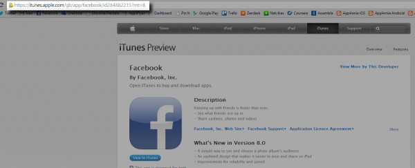
Notice the URL of the app in my case contains /gb/, which denotes the country (and language) of the app store I am viewing. However I can change this. To see this same app in the Spanish App Store, all I need to do is change this to /es/.
Notice below that once I change the URL, the meta data of the page changes as well (as does the app description if the app already has a localized version). This is important for the next step of the research process – in particular the localized version of the category and the meta data that denotes language.
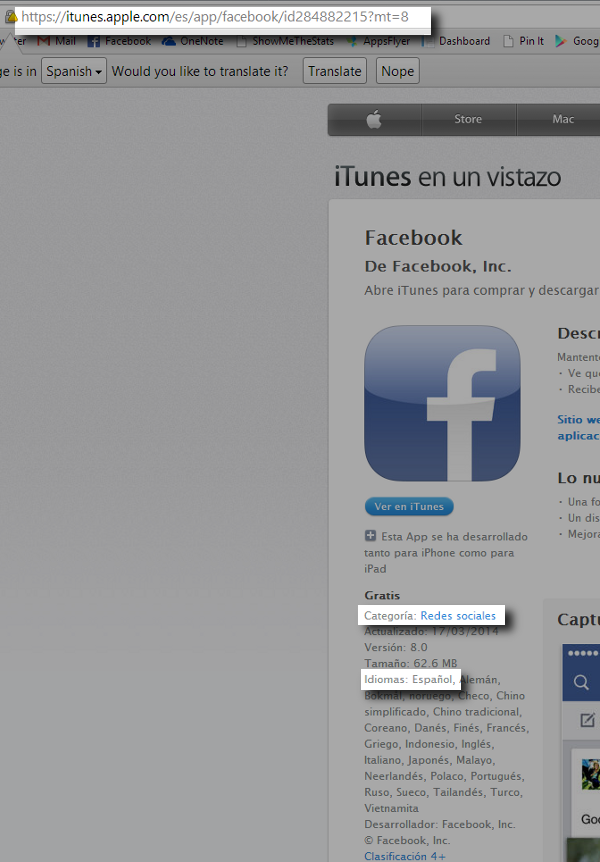
Now we have three key bits of information: the URL format for the local app store, the localized meta data for language and the localized meta data for category. Using the Google site search function, we can put this all into a Google search. As you can see below, I am searching for all pages indexed in Google that are within the Spanish App Store site, and contain exactly the phrase that corresponds with the meta data that indicates the app is in the social category and available in the Spanish language.

As you can see, the search results returned will link me to pages within the Spanish App Store with Spanish language social apps. Job done!
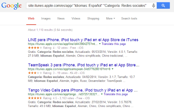
This is a huge volume of search results so I can continue to refine the results to just my potential competitors by adding additional keywords (in the local language of course – Google Translate can help you out here) to my Google search.
Understanding local competitors can be key in successfully localizing your app. This is one way to find out who the players are in your new space. Any other techniques you know for finding competitive apps when localizing?

While a wealth of analytics tools gives us increasingly detailed views into how users navigate through our systems, services and apps, there’s no metric that tells you how your users were feeling at the time. In fact many of the terms that we measure for technology services, such as bounce rate, retention and number of pages viewed, all act as a stand in for how users were feeling – and one emotion in particular: frustration.
Frustration is the silent killer of technology businesses. It’s the feeling that causes users to close the screen, or worse delete the app, without giving you any idea as to why. Sometimes frustration can build over time, meaning that a series of frustrations can lead to a developer mis-attributing the source of lost users. Of course you can survey your users, run user tests and look to your app reviews for indications as to how people felt about your service, but by the time someone has become frustrated or annoyed it’s unlikely they want to spend additional time providing feedback.
However there is one metric that, at least in the mobile app world, can often be a strong indicator of the building level of frustration of your users – and that is time.
Coming from a web marketing world, where “time on page” was a key metric that web owners tried to optimize for, not against, it’s a fairly significant change in thinking. But with such limited real estate on a mobile app screen, there’s not a huge amount to occupy a user’s time on functional pages – such as screens to sign up, options, invite or settings. Increased time spent on these screens can signal that something is overly complicated, difficult to understand or generally frustrating for the user.
There are a number of tools that help app developer measure time spent per screen, although all have limitations and a fair bit of set up required. The one that gives the best indication is Google Analytics for Mobile:

However to get an accurate reading for this metric, Google requires a lot of advanced set up, including detailed naming of all of the screens within your app. Additionally, Google is great for looking at average results across your whole audience but has significant limitations for drilling down into your audience – it’s much harder to see who is having trouble with your app screens and the range of times it takes different segments of your audience to move through your app.
An alternative is Mixpanel which doesn’t allow you to see the average time that users spend on a specific screen, but does allow you to see the time it takes for user to move through a series of predefined steps in, say, a sign up funnel.

Like Google, Mixpanel requires some initial set up, but allows for much greater segmentation of your userbase, to determine which subsets of your users are taking the most time to get through your app. For many independent developers, however, Mixpanel’s higher costs can be off-putting.
Regardless of how you measure the time that users spend on various screens within the app or service, this us an often under-utilized metric that tells you quite a bit about how frustrated or confused your users are. If a screen that takes you 15-20 seconds to pass through has an average use time of over a minute, your audience could be missing the point, unable to find a button or unsure of what to do.
Using time as a proxy for frustration in your app or service can help highlight places where you’re causing users to fall out of love with your product, even if it’s not the place where they give up on your app entirely.
A quick one before a more thorough summary of my week at Mobile World Congress – I gave this talk as part of the Advanced User Interfaces Seminar at Mobile World Congress 2014 (#mwc14) hosted by the UK’s ICT KTN. It covers the challenges and proposes some solutions in designing and testing apps and mobile services geared towards a non-traditional audience such as elderly, disabled or young users.

I was recently quoted in an article rounding up predictions for mobile in 2014 (20 Mobile Industry Expert Predictions for 2014). There were a lot of comments about mobile commerce, mobile marketing budgets increasing and tracking, but no one else seemed to share my prediction:

Building 23snaps has been an amazing learning experience in so many ways, but none more-so than the wake up call that the vast majority of consumers, across any market, are not tech-savvy millennials who will forgive UI inconveniences for the sake of using the latest technology. At 23snaps, many of our users are using a technology other than email for enjoying family photos for the very first time. That can be hard enough for them on the computer, but add a new smartphone into the mix and suddenly there are a lot of our customers who need, if not hand-holding, some excellent sign-posting to help them figure out what to do next.
I would like to think that I’m not the only one who noticed this trend. As I mentioned in my prediction, iOS 7 was a jarring experience for many users. In fact the AARP, a membership community and non-profit for US over-50s, actively discouraged its members from upgrading to iOS 7 as late as 30 October, 2013 (iOS 7 was released in June). They said:
“The font is very light and may be hard to read for some. The icons appear flat and move quickly across the screen, causing some people to report dizziness.”
If Apple thinks this recommendation from AARP is no big deal, they should check the membership roster. AARP has over 40 million members.
But the bias towards user interface design that favors the tech-savvy is pervasive through the entire industry – and at times this is dramatic enough to confuse even the millennials. Look, for example, at the Facebook ‘Other’ inbox, for most people a hidden repository of lost birthday wishes, invitations and requests.
An enormous audience has access now to technology that should make their lives easier in every way. But instead the applications and services available leave many of them confused and frustrated. In the last few years, the audience of non-digital natives using the latest technology has become the majority but products and services aren’t catering to them, missing out on profit and growth opportunities.
2014 needs to be the year that designers and developers begin considering the experience for someone who doesn’t understand that three horizontal lines means ‘Menu’ or that an eight-pointed star means ‘News Feed,’ or even what a ‘News Feed’ is. There is a balance to be struct between spoonfeeding digital natives, but creating a beautiful, usable product, that signposts the most important elements for those who are discovering them for the first time.

PandoDaily has recently started a series on “Anti-Social Networks;” that is, the online networks that don’t really fit the mold of the big social networks that currently dominate the landscape. Sarah Lacy writes:
“An anti-social network isn’t as simple as being a mere Facebook alternative, or a niche social network. Those have both been tried in spades, and have failed along the way, even when Facebook was weaker…. When it comes to building a consumer Web company around human relationships, the smartest entrepreneurs aren’t thinking niche. They are thinking orthogonal. There’s a difference. Look at the core things Facebook does well: photos, connecting you with everyone you know, providing a permanent record, and real identity. These are the exact four things that have made Facebook a powerful company with users and advertisers; these are the four things it can’t betray and hope to succeed.” (Sarah Lacy, Screw virality! Antisocial networks are on the rise, PandoDaily)
PandoDaily has explored some interesting examples (like SnapChat and Nextdoor) of services that offer alternatives to Facebook’s way of approaching photos, connecting with everyone and a permanent record, but have yet to explore the ways some networks are approaching alternatives to your real identity.
Facebook’s focus on a real identity and building a permanent personal record means that there are opportunities for online communities where the individual user themself is not the focus, but instead the community revolves around the content they create.
A few examples of this type of network include our company, 23snaps, where small groups of users (such as parents and grandparents) create and manage a profile and photo timeline on behalf of their child; communities like TripAdvisor where the interaction centers around a travel destination or venue; or networks like Fanfiction.net or DeviantArt where the focus is creative works.
In all of these cases, the primary focus is not the user participating in the community, nor individual relationships between the participants. While users may have a personal profile; engagement, interaction and discussion pivots around the content they’ve created.
This is especially powerful for subjects that cannot manage a profile for themselves. For 23snaps, parents maintain a profile for an infant or young child without the issues that would arise from actually creating a Facebook profile for a baby. A similar network could potentially exist for pet owners, or a classroom. For TripAdvisor, a community maintains a profile for a city or region.
While Facebook Fan Pages attempt to bridge the gap between an individual profile and a third party entity, the focus is too heavily weighted towards a personal timeline where the individual controls their own identity. Communities that jointly manage and interact with subjects that cannot manage their own online identity, or with creative content will always have opportunities for growth that won’t be infringed by Facebook.
“Anti-social networking” may be the wrong term for networks that deviate from Facebook’s core way of thinking but the successful networking services that do so are intriguing examples of both new revenue and networking models and what consumers are looking for.
 Meaghan Fitzgerald is a marketer and entrepreneur building and growing consumer and gaming products and experiences. A Silicon Valley native, she started her first company, DormWise, in 2006 which she later sold in 2009. Meaghan spent 7 years in London in early stage consumer startups, two years at Xbox as a product marketer for Minecraft, and is currently the head of product marketing for VR experiences at Facebook and Oculus. Meaghan writes here about business, technology, gaming, and marketing. She has been named a top